Vaccine Update
Kansas is ranked #25 in the nation in terms of vaccine doses distributed to the state per 100,000 by the federal government (last week #22), and #47 in terms of persons receiving at least 1 dose per 100,000 residents (last week #46). According to NPR, 6.6% of the Kansas population has received at least one dose of the vaccine. The state has used 51% of its dose allocation, ranking it #49 in the nation. What does all of this mean? It means that we have fallen off the pace for getting vaccinations to the people who need them. We’re in the top half of the states in terms of getting doses from the federal government, but we aren’t using them efficiently and are at the bottom for using the precious doses we’ve been given. It’s really, really not okay. Those doses represent lives saved (or not saved).
You can see the Kansas vaccine information page here. The Centers for Disease Control and Prevention COVID-19 Vaccine Data Tracker is also a useful too, but be advised that the Kansas numbers are only updated with them on Monday, Wednesday and Friday.
I’ve done some additional writing on the COVID vaccines recently.
How the Johnson and Johnson and AstraZeneca vaccines work. And updated data regarding the more transmissible variants and COVID-19 data for children from the Advisory Committee on Immunization Practices.
What having a more transmissible variant means. It isn’t necessarily more deadly to an individual who is infected, but it’s more “shots on goal” for the virus. So that will mean more cases, hospitalizations and deaths. The pertinent section for this is toward the bottom of the linked newsletter.
A comparison of vaccine efficacy between the Pfizer, Moderna and Johnson and Johnson vaccines. Much is being made of the “66% efficacy” headline for the Johnson and Johnson vaccine, but this is an artifact of when data is collected for each of the clinical trials. By the end of the time course, the Johnson and Johnson vaccine shows similar efficacy to the Pfizer and Moderna vaccines. So get the first vaccine that is made available to you - they’re more or less equal anyway.
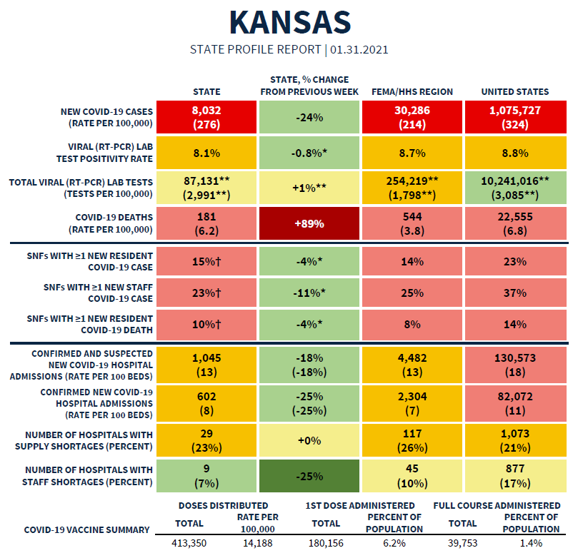
The White House state report for Kansas can be viewed in full here. The summary table is provided below. Kansas is mostly in the red and yellow zones with good improvement over the past week. The exception is the death rate, which showed a big spike last week (+89%).
Combined Data
The graph below shows us how some of our most important data points are moving over time. Cases are represented by the blue line and correspond with the left y-axis. All other metrics (hospitalizations, ICU admissions, deaths) correspond with the right y-axis.
Cases continue to drop dramatically. That’s a good thing. ICU admissions have also declined. However we’ve seen the descent slow for hospital admissions (gray line). And we’ve seen a small uptick in deaths in the past week.
According to the most recent White House State report, Kansas has the following rankings:
#27 for new cases per 100,000 (red zone)
#28 for test positivity (orange zone)
#29 for new COVID-19 hospital admissions per 100 beds (orange zone)
#24 for new deaths per 100,000 (red zone)
Testing
The graph below shows us how Kansas is doing for tests performed (blue line, left y-axis) and the percent of those tests that are positive (red line, right y-axis) on a weekly basis. The goal line for test positivity (5%) is indicated by the gray, dashed line.
Test output has declined 42% in the past two weeks. So far, that hasn’t corresponded with an increase in test positivity - this can happen when you aren’t testing widely enough. And we’re nearly back to the goal line of 5% test positivity. But I am really concerning about the decrease in testing output because while cases are declining the arrival of the more transmissible variant that has become dominant in the United Kingdom (known as the B.1.1.7 variant) has been found in several states (541 cases so far) and often these people don’t have a history of recent travel. That suggests that the variant has been spreading quietly throughout the country. The idea that Kansas has 0 reported cases so far does not mean it’s not here already. The US does not have a robust surveillance program to watch for this variant. We likely have many, many more of these cases than we realize. This variant is expected to result in a dramatic rise in cases. When I see the test output drop as it is here, then I worry that we will have a dramatic rise in cases (especially asymptomatic ones) that we can’t see or detect. It might make it harder for hospitals to see what’s coming. But we will see the impacts on hospital burden and death.
Cases
In the past week there have been 6398 cases newly reported by the Kansas Department of Health and Environment. That’s a decrease of 30% compared to the previous week. The weekly case rate per 100,000 residents for the state is only 9.2% above the pre-surge level, which is very good. The case rate is lowest in Frontier counties and highest in semi-urban counties. You can check to see your county’s classification here.
The state average has decreased from the peak experienced in mid-November, and has declined sharply in the past two weeks. It’s possible that part of this descent is a result of decreased testing, but the test positivity rate does not indicate that we’re missing a lot of cases.
The map below comes from the Brown School of Public Health. It grades each county’s level of risk, based on the average daily cases per 100,000 over the most recent 7 days. Risk is greatest for red counties and least for green counties. Around the beginning of the year, the entire state was red. Now, we see definite signs of improvement, especially for the western half of the state. However, the more densely populated eastern half of the state needs to continue to aggressively limit disease transmission.
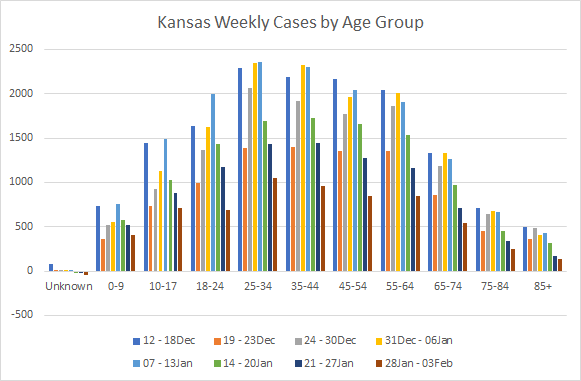
Next, let’s look at where the most recent week’s cases are coming from in terms of age groups. The graph below shows 8 week timelines for each age group with the most recent week shown in maroon. One heads up, the “week” of 19-23Dec was a shorter week than usual so that week’s data are an anomaly.
This week we see continued decreases for every age group. That’s certainly good news.
But something interesting is happening with the latest outbreak report. Last week there almost as many clusters associated with private businesses as there were at long term care facilities. Let this just be a reminder that just because something is open does not mean that it is a safe environment or a smart thing to do.
Another thing from the cluster report is an increase in cases at corrections facilities. This is one of the most likely places for outbreaks to occur, along with long term care facilities.
Hospitalizations
This week there were 316 newly reported hospital admissions compared to the week prior, a decrease of 5%. The graph below shows us where those hospital admissions are coming from in terms of age group, over the past 8 weeks. I want to again remind you to not worry too much about the week of 19-23Dec because it was a short week.
Many age groups saw a decrease this week. But increases were noted for those 25-34, and 45-54.
According to the HHS Community Profile Report for 02Feb2021, Kansas is ranked #32 in the nation for new COVID-19 admissions per 100 beds (last week #30). This is the same source of data that’s used for the White House state reports, but updated daily rather than weekly. The report also indicates that 58% of the state’s inventory of inpatient beds are occupied (within normal limits) and 8% of the state’s beds are being used by COVID-19 patients (yellow zone). If we look just at the state’s ICU beds, then 75% of them are full (normal) and 19% are occupied by COVID-19 patients (light red zone).
Deaths
Using the HHS Community Profile Report (date 02Jan2021), Kansas has the 21st highest newly reported death rate per 100,000 residents in the country, a big increase from where we were last week (41st).
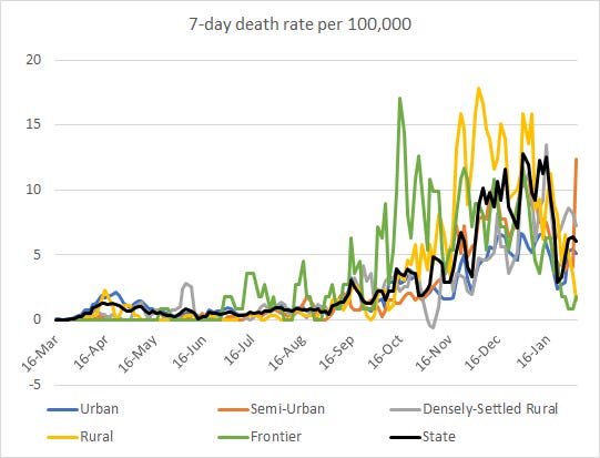
In the most recent week, Kansas has reported a net increase of 177 deaths, an increase of 24% compared to the previous week. The graph below shows us how deaths have trended over time, adjusted for each county type’s population size. The statewide average is shown in the black line. You can check your county’s classification here.
The death rate for Kansas has risen a bit but the previous week was a really large drop. It makes me wonder if we have some delayed reporting going on because typically it takes a lot longer to descend from a surge than to climb it. The death rate spike we’re seeing now is largely driven by semi-urban counties (this county class includes Butler, Crawford, Franklin, Geary, Harvey, Reno, Riley, Saline). The bulk of the semi-urban deaths came from Butler and Crawford counties.
We can also see where deaths are coming from in terms of age group in the graph below. Like the other demographic graphs, this shows 8-week timelines for each age group. This week we saw increases for all age groups older than 34.
References
https://covid.cdc.gov/covid-data-tracker/#vaccinations
https://www.kansasvaccine.gov/
http://www.ipsr.ku.edu/ksdata/ksah/population/popden2.pdf
WHCTF report repository: https://beta.healthdata.gov/Community/COVID-19-State-Profile-Report-Kansas/scin-7ddt
https://www.cdc.gov/coronavirus/2019-ncov/covid-data/covidview/index.html
https://www.cdc.gov/mmwr/volumes/70/wr/mm7004e3.htm?s_cid=mm7004e3_w
https://jamanetwork.com/journals/jama/fullarticle/2775875
https://beta.healthdata.gov/National/COVID-19-Community-Profile-Report/gqxm-d9w9
Kansas COVID-19 Updates is a free newsletter that depends on reader support. If you wish to subscribe please click the link below. There are free and paid options available.
My Ph.D. is in Medical Microbiology and Immunology. I've worked at places like Creighton University, the Centers for Disease Control & Prevention and Mercer University School of Medicine. All thoughts are my professional opinion and should not be considered medical advice.


