The World
Globally, the SARS-CoV-2 virus that causes COVID-19 disease has sickened > 58.8 million people (+4.2 million since last week) and killed at least 1,389,500 1,320,100 (+69,400 in the past week) as of this morning.
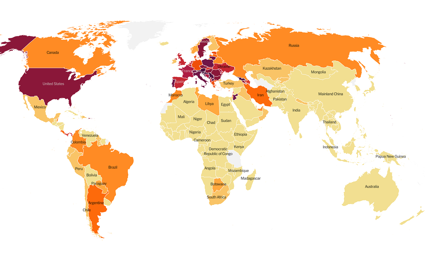
The US is ranked among the top color categories for hot spots. Things are similarly intense in parts of Europe, Jordan and Armenia. We are ranked #17 in the world for average daily case rate per 100,000 people over the past 7 days (last week, 23rd) with a rate of 51.6 compared to 45.3 last week. The top five countries for average daily case rate per 100,000 in the past week are Georgia, Luxembourg, Montenegro, Serbia, and Andorra.
For deaths, our average daily death rate per 100,000 over the past week is 0.5, higher than last week (0.3), and we are ranked #33 in the world for this (last week we were ranked #41). The top five countries for average daily death rate per 100,000 in the most recent week are Slovenia, Bosnia and Herzegovina, Bulgaria, Belgium, and North Macedonia.
The United States
As of this morning, there have been over 12.3 million cases (+1.2 million in the past week) and 256,755 deaths in the US (+10,672 in past week). Keep in mind that both of these numbers are probably an under-count of the situation in our country. The CDC recently added a county view to it’s COVID Data Tracker site. The best data are recent (i.e. in the past 14 days), local and adjusted for population. The CDC resource features all of those qualities. The problem I have is that it doesn’t allow you to see the entire continental US at the same time. So, for the time being, I’m still using the New York Times COVID data tracker to show you the maps of the world and the US.
The top five states in the nation for average daily case rate in the past 7 days are North Dakota, Wyoming, South Dakota, New Mexico and Minnesota. The top five states in the nation for average daily death rate in the past 7 days are South Dakota, North Dakota, Guam, New Mexico, and Montana.
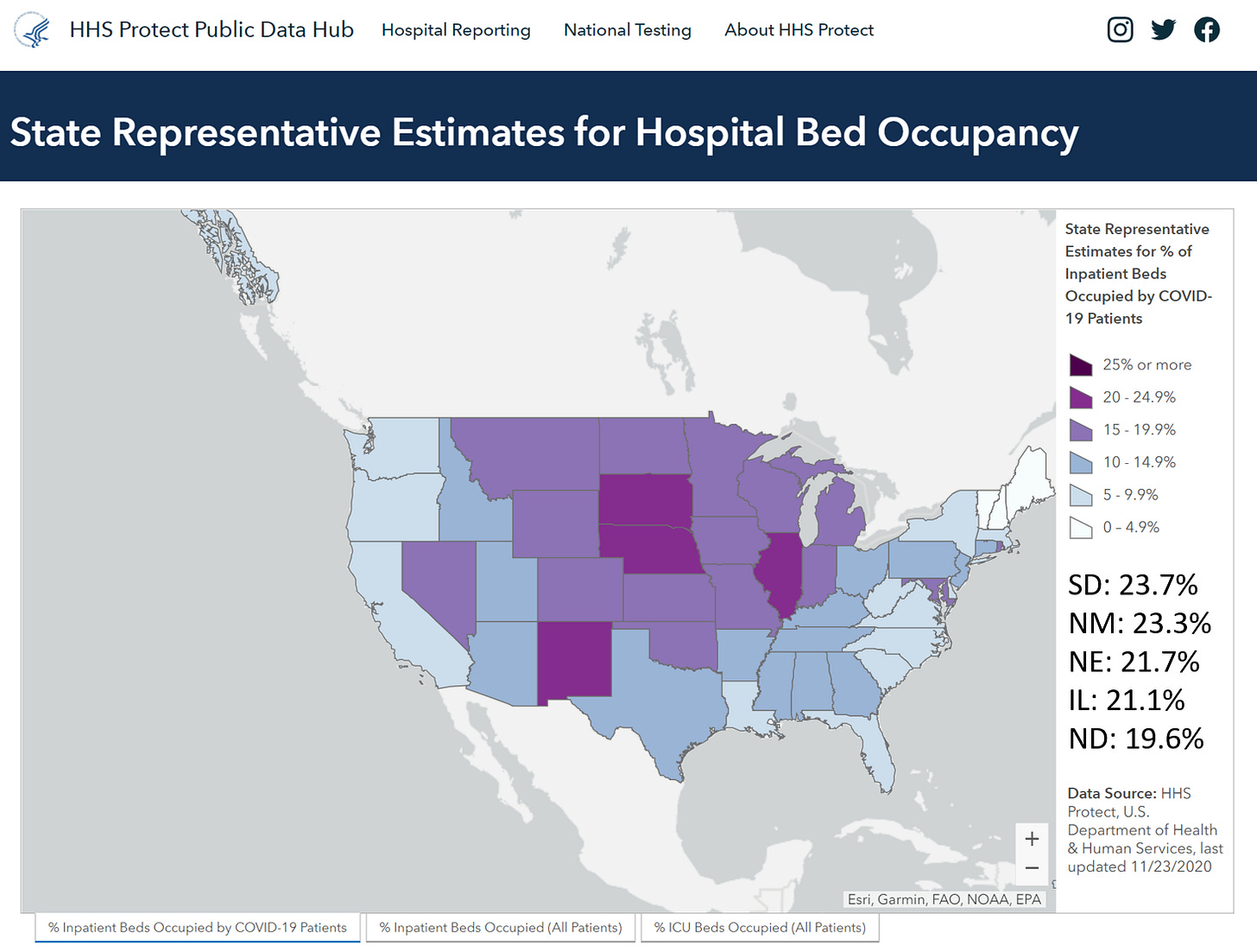
The table below tells you where we are this week and how that compares to the previous week (in parentheses). The data for everything but the percent of inpatients with COVID-19 comes from the New York Times coronavirus tracker and is current as of this morning. The hospital data comes from the HHS Protect Public Data Hub and was last updated on 23Nov2020.
We are seeing big jumps in our test rate, proportion of hospital beds occupied by COVID-19 patients and death rate, all of which are increasing more than the national rate. Here’s a look at how COVID-19 is contributing to hospital admissions for the broader US. The map below shows how many inpatient beds in each state are occupied by COVID-19 patients.
From my perspective, checking this map weekly, it’s wild to see so much purple. We literally have never seen this much hospital demand for COVID-19 on such a widespread basis. This week the national proportion of hospital beds in use for COVID-19 is up 42%. And we haven’t even gotten to Thanksgiving and its effects yet.
Next, let’s look at how seasonal influenza is impacting different states across the US. This week Iowa jumped from Moderate to Very High. Things also ticked upward for North Dakota, Idaho, New Mexico and Oklahoma. Things are steady among the other states in the US this week. You can consult FluView any time you’d like to see this map and other data visualizations.
Kansas is in the top shade of the minimal category. Keep in mind that influenza is not a mandatory notifiable disease for public health departments like COVID-19 is. But there is a robust surveillance network for tracking trends. So we aren’t likely to see case counts and death counts like we do for COVID-19 because we are seeing estimates for influenza rather than actual numbers. Both diseases feature a wide spectrum of disease severity that can make it hard to identify all cases. You can read the weekly report from Kansas Department of Health and Environment here.
Kansas
Here’s the latest map from the Harvard Global Health Institute for the state of Kansas. You’ll notice that most of the state is filled in red, the most intense category. There are only three non-red counties. This. Is. Bleak.
Let’s say that you’re planning to have a gathering of 15 people for Thanksgiving dinner. This risk assessment tool provided below from Georgia Tech tells you the risk that someone at that event will be COVID-19 positive, regardless of whether they’re symptomatic. For many Kansas counties the risk is above 75%. If you are planning to have a Thanksgiving gathering of this size, I might recommend making an appointment now for the following week to be tested for COVID-19.
References
https://www.nytimes.com/interactive/2020/world/coronavirus-maps.html
https://globalepidemics.org/key-metrics-for-covid-suppression/
https://covid19risk.biosci.gatech.edu/
https://protect-public.hhs.gov/pages/hospital-capacity
https://www.cdc.gov/flu/weekly/index.htm
https://www.coronavirus.kdheks.gov/160/COVID-19-in-Kansas
Kansas COVID-19 Updates is a free newsletter that depends on reader support. If you wish to subscribe please click the link below. There are free and paid options available.
My Ph.D. is in Medical Microbiology and Immunology. I've worked at places like Creighton University, the Centers for Disease Control & Prevention and Mercer University School of Medicine. All thoughts are my professional opinion and should not be considered medical advice.


