COVID-19 in Kansas, 22Oct2020
Kansas COVID-19 Updates
Next, I’d like to discuss two important COVID-19 journal articles that were released yesterday in the CDC’s Morbidity and Mortality Weekly Report. Let’s first begin with a large study that compared hospitalization data among Veterans Health Administration patients for COVID-19 (2020) compared to past influenza seasons (2018 until February 2020 to avoid confusion with COVID-19 illness). Below, I’ve put together some of the biggest findings from the article. What this tells us is that COVID-19 disease and influenza really are not the same thing at all. So hopefully with these data, we can stop spreading the disinformation that this is just the same (and the implication is just as minor) as the flu.

Not only are hospital stays longer, a person with COVID-19 is more likely to be admitted to the ICU and more likely to die in the hospital than someone suffering from influenza. They are also 19 times more likely to suffer from the complication, Acute Respiratory Distress Syndrome, a rapid form of respiratory failure that features widespread inflammation in the lungs. But there are also a lot of other complications that have to do with blood clotting.
The second study has to do with excess deaths that have taken place in 2020 compared to past years. Some of this is not new information, because I’ve talked about excess deaths here in the past. But the study helps us to put some numbers on things and really see some of the disparities that exist. As of October 3rd, there have been 299,028 excess deaths and and 66% of them are attributed to COVID-19. But here again, we get to see how COVID-19 compares to flu.
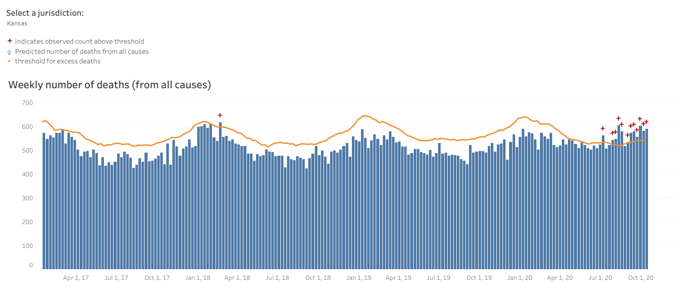
First, let’s look at how deaths of all causes compare this year to the trends over the past 5 years for Kansas (below). The orange line below is the threshold above which deaths are considered to be above normal and “excess.” Each bar represents a week’s total deaths, with delayed reporting impacting the most recent 1-8 weeks. You can see that we’re well above the orange line this year. But you can also see that we’ve surpassed that number before, in January of 2018. The 2017-2018 flu season was a particularly bad one so a lot of this excess is likely due to flu. That year, we did see excess deaths and while they were intense, they were brief. In recent history, since the start of the pandemic, the excess has been intense and sustained. This is a stark difference between COVID-19 and flu.
In the current study they quantified the percent change in deaths for age and race/ethnicity. One of the most surprising things to come out of this study is that the largest shift in excess deaths (26.5%) has taken place among the young, aged 25 - 44. This is important for two big reasons: (1) we tend to think of the death impact being most problematic for those >65 years of age. It negates the notion that young people are not impacted. (2) This is another big departure from how influenza usually affects our population, where the ones most likely to die are the very young and the very old.

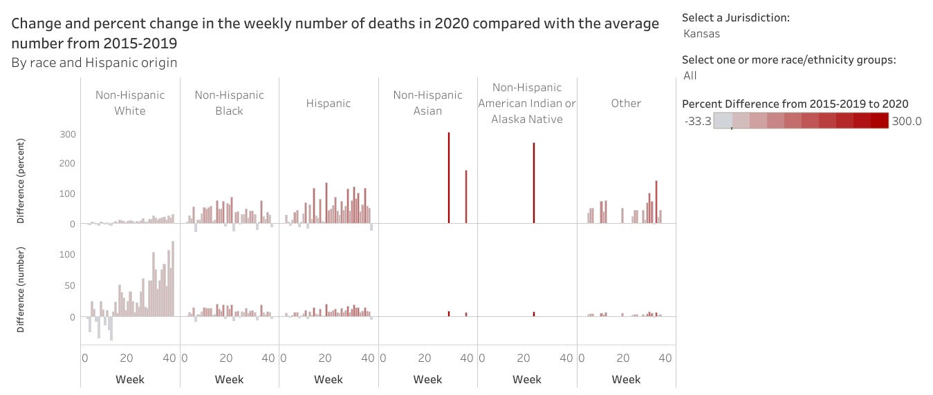
For race and ethnicity, here’s what they found. The excess deaths increased by 12% for White populations and they fared the best. However, the increase was much greater for all other races and particularly large for Hispanic populations (+54% compared to past trends).

If we look at this similar information but for Kansas (top row, percent difference), here’s what it looks like. Compared to non-Hispanic White populations, the percent increase for all other race and ethnicity categories is much greater.
The White House Coronavirus Task Force report for Kansas is still not available for the public to see. I have open records requests pending with the Kansas Department of Health and Environment and the US Department of Health and Human Services. However, we can see some of how Kansas is doing from the national picture sections of other state reports. You can see all the reports that are available to the public at the Center for Public Integrity. For now, we’ll look at the national picture data in the report for our neighbor, Colorado.
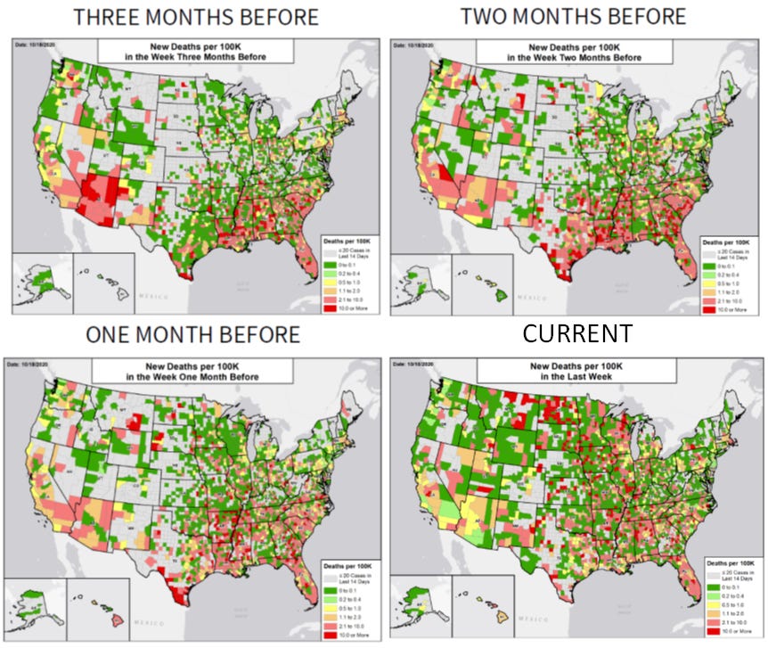
They have Kansas ranked #17 in the nation for weekly case rate per 100,000 people, considered to be in the red zone. Below you can see how the situation has evolved nationally over the past three months. For Kansas, we started out with relatively few counties shaded in as things were far more intense in the South and Southwest. However, starting two months ago, we began to see more cases, particularly in counties in the southern half of the state. Cases intensified and spread to neighboring counties and now much of the state is colored in red and dark red. We aren’t alone in this. Nearly all of our neighbors, with the exception of Colorado, are mostly colored in.

The map timeline for percent positive rate is shown below. As a reminder, percent positivity tells us how well we are doing on testing widely enough in the population. The goal is to be at or below 5% (green color coding). You can see from the current view that the western half of Kansas has very high positive rates, upwards of 20%. Together with case rates per 100,000, these metrics tell us that disease is high in these areas but that we are probably only capturing a fraction of the disease that’s out there with our current testing. Overall, Kansas is ranked #10 in the nation for percent positivity, classified in the orange zone.

Finally, let’s turn to deaths. Kansas is ranked #4 in the nation for weekly deaths per 100,000 residents, in the red zone. The series of maps below shows us how things evolved for this metric over time. In this series, you want to have completely unshaded counties. Even green color coding is not good - it just indicates deaths per 100,000 at a smaller scale than others. Three months ago, deaths were largely confined to a fraction of the state’s counties. As time progressed, the counties experiencing deaths were largely in the green category (better than it could be). However, in the current view, many more counties are shaded in and now about a dozen of them are shaded red, the most intense color category.
Turning more specifically to data provided by the state of Kansas, here’s how percent positivity has changed over the month of October so far. Keep in mind that the drop off you see in the most recent period is probably due to delayed reporting. What this graph shows is that we aren’t doing enough testing in the right places and the problem is growing.

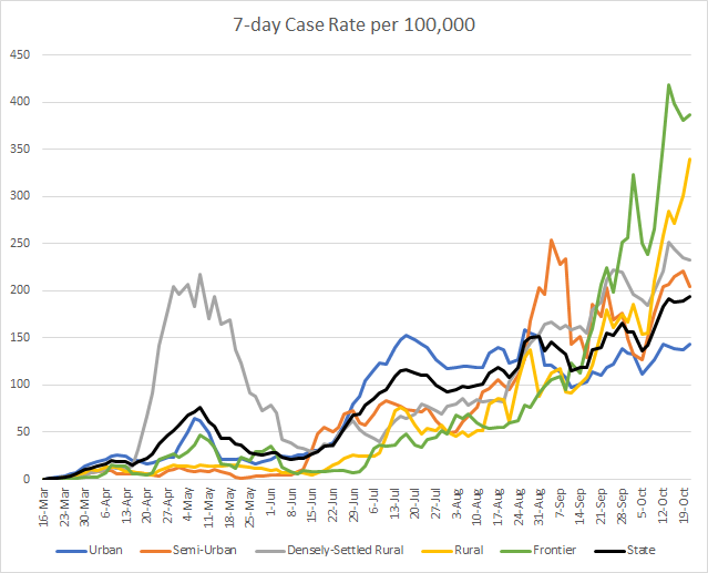
Here’s how case rates per 100,000 residents are trending over time for the different county types in Kansas. The state average is represented by the black line. We can see that the case rate has been steadily increasing since mid June. We can also see that there’s been a bit of a baton-passing from county type to county type. Most recently, the case rates have been greatest in frontier counties. But rural counties (slightly more populated than frontier counties) are surging upward dramatically. These data are current as of yesterday, October 21, 2020. You can look up your county classification here.
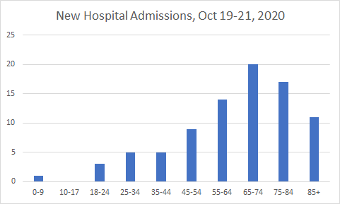
Here’s how new COVID-19 hospital admissions were distributed by age this week between the Monday and Wednesday data updates.
And below you see the 7-day death rate per 100,000. Frontier counties are disproportionately impacted by deaths, with a rate that peaked at 3.8 times higher than the state average. Thankfully, that trend is dropping, but the death rate in rural counties is climbing just as we saw for case rates.

And here’s the distribution of newly reported deaths between the Monday and Wednesday data updates.

That’s it for now. Hopefully the White House Coronavirus Task Force report comes out soon. I’ll be sure to include those data in a future report. Until next time, be safe and be well!
References
https://www.cdc.gov/mmwr/volumes/69/wr/mm6942e3.htm?s_cid=mm6942e3_w
https://www.cdc.gov/mmwr/volumes/69/wr/mm6942e2.htm?s_cid=mm6942e2_w
https://www.cdc.gov/nchs/nvss/vsrr/covid19/excess_deaths.htm
https://publicintegrity.org/health/coronavirus-and-inequality/white-house-coronavirus-red-zone-reports-covid/
http://www.ipsr.ku.edu/ksdata/ksah/population/popden2.pdf
Kansas COVID-19 Updates is a free newsletter that depends on reader support. If you wish to subscribe please click the link below. There are free and paid options available.
My Ph.D. is in Medical Microbiology and Immunology. I've worked at places like Creighton University, the Centers for Disease Control & Prevention and Mercer University School of Medicine. All thoughts are my professional opinion and should not be considered medical advice.

