COVID-19 in Kansas, 16Oct2020
Kansas COVID-19 Updates
The latest White House Coronavirus Task Force (WHCTF) report has been released, summarizing where Kansas is in relation to the rest of the country. Today, I’ll go over the report and the latest numbers from Kansas Department of Health and Environment (KDHE). You can read all of the WHCTF reports that have been made available for Kansas by visiting the Center for Public Integrity.
Also, I made an error when formatting the most recent newsletter. It only went out to a small percentage of the subscriber list. To read the most recent newsletter, click here. My apologies.
Testing
Kansas has done better than many states at approaching or meeting the national average for tests per population. Below, you can see how we’ve done over time. Kansas is represented by the blue line.

Percent positive rate is an important thing to consider alongside case rates per 100,000 people. The latter tells us how intense disease is in the local area. The percent positive rate tells us how much of that case rate might be an under-count, indicating that we may or may not be missing cases that are circulating in the community. The closer you are to 5% positive, the better the state (or county) is doing. As the number increases above 5%, the greater the likelihood that we aren’t testing enough people and cases are escaping our notice, contributing to ongoing disease transmission.

Kansas (blue line above) has exceeded the national percent positive rate since mid-July. The positive rate has declined since the beginning of September (a positive development) but never did reach 5%. The state noted an increase in percent positivity this most recent week. More concerning, however, is what is happening to the national rate, where multiple weeks of increase have wiped out the gains made since mid-August. It should be noted that both the graphs for this section based on the WHCTF report only include data on the PCR diagnostic test for the SARS-CoV-2 virus (causes the disease, COVID-19). In recent months, the rapid antigen test has gained in popularity. As that popularity grows, the results associated with those tests are not captured in the test rate per population or the percent positive rate. Governor Kelly has announced that 870,000 of these tests are being deployed in Kansas.
Cases
Unlike the way the WHCTF evaluates test data, they measure case rate per 100,000 based on whatever the state is reporting. Many states include both PCR- and antigen test-identified cases in their combined case total, including Kansas. That’s important because it gives us the clearest picture of where disease is located and possibly spreading. Let’s take a look at how Kansas is doing relative to the United States.

Since mid-August, the case rate in Kansas has exceeded the national case rate. And while the national rate has held relatively steady (with recent increases), the Kansas rate has continued to climb since mid-August. At present, the case rate in Kansas is 64% higher than the national rate.
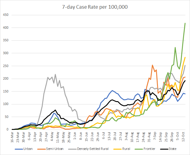
If we look a bit closer at the Kansas data since the start of the pandemic, you can see how the pandemic has moved more intensely through different communities within the state. For the graph below, it is showing the average of the most recent 7 days (calculated anew each day) for each county per 100,000 residents. Obviously, most counties in Kansas do not have 100,000 residents, but this scale is the standard used when looking at COVID-19 data. County classifications in this graph are based on KDHE guidance that is best represented in this map from University of Kansas. The statewide average is shown in the black line.

Coronavirus seems to have marched through Kansas counties in four stages. First, it was felt most intensely in Densely-Settled Rural counties (there are 21 such counties, examples include Finney or Atchison counties). During the summer, the virus expanded its reach to other areas but was most intense in Urban counties (n = 6 counties). As we transitioned into autumn, the disease continued to intensify across all county types, but the increase was most intense in Semi-Urban counties (n = 8 counties. Then, in September, as case rates continued to surge throughout the state, it was most intense in Frontier counties (n = 37 counties, mostly in western Kansas). In recent days, however, the surge is nearly identical across all county types, a worrying sign indeed.
Moving back to the WHCTF report, the graph below shows how they have identified counties as being in the red, orange and yellow zones over time. The black line shows the combined total.

The number of counties on their list has increased steadily since early August. At present, 57% of Kansas counties are in either the red, orange or yellow zones.
Here is the age distribution of this week’s cases, by date of report. You’ll notice that the cases are greater among those considered to be working-age population (18 - 64) and those 25 - 34 are the leading age group. In total, there have been 5,045 newly reported cases since last Friday.

Hospitalizations
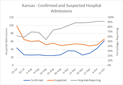
The graph below is based on the WHCTF reports since mid July. It shows us how many hospitals are reporting into the tracking system and how many COVID patients (with either confirmed or suspected COVID-19 diagnosis) have been admitted to the hospital. The right y-axis corresponds to the gray line (hospitals reporting) and the left y-axis corresponds to the red and blue lines (hospital admissions).

The number of confirmed case hospitalizations has surged since late September and now stand 138% higher. More recently, suspected case hospitalizations have also increased. As for other states, there are worries that this surge in hospitalizations could overwhelm our health care infrastructure and ability to care for the sick. Typically, hospitalizations are a lagging indicator to cases by about one week, because of this timeline shown below.

If a person is likely to need hospitalization, the median length of time since symptom onset (day 6 on the timeline above) is 4 days for those >65 years of age and 6 days for younger adults. So that would put them at days 10-12 on this timeline. The unfortunate flipside of this timeline, is that if we want to take action now to stop hospitalizations from surging further, it will take weeks to make an impact. Because the people who will be in the hospital next week have already been exposed to the virus this week, and so on. The bigger the disease transmission rate becomes, the harder it is to stop this surge. It is therefore important that we all take steps to limit disease transmission by wearing masks, avoiding unnecessary errands, avoiding crowds and observing a 6-12 foot distance with others, and staying home when we don’t feel well.
A particularly dangerous situation is when COVID-19 arrives in a skilled nursing facility (SNF) such as a nursing home or inpatient rehabilitation center. Using data from the WHCTF reports, the US rate of SNFs with at least one COVID-19 case has been as high as 12% but decreased in recent months. Unfortunately, Kansas has seen that rate increase steadily since mid-July and now we are comparable to the national average, at 9%.

Because of the medical reasons why a patient might need skilled nursing care combined with the congregate living situation and difficulty with applying social distancing, skilled nursing facilities are the worst place for COVID-19 to be.
The graph below shows the distribution of the most recent week’s new hospital admissions for COVID-19, by age. You can see that hospitalizations increase with age, peaking with the 75-84 age group. In total, there have been 185 newly reported hospital admissions since last Friday.

Deaths
The graph below shows how the COVID death rate per population has varied over time for Kansas and the US, using data from the WHCTF reports.

For much of the pandemic, Kansas has been below the national average. But that has changed in the last month or so. Looking more specifically at where the deaths have been more intense, a couple things stand out. Since the summer, the counties experiencing the most severe death rates have been Frontier and Densely-Settled Rural counties. This is consistent with what I observe when looking at the data for Georgia.

Rural or sparsely populated counties have a double whammy working against them. Because there are often healthcare deserts in these communities, residents might have a harder time managing chronic conditions and taking advantage of preventative care. It can also be a challenge to get them the information they need to know about the virus, social distancing and mask wear. Moreover, it’s harder for them to practice things like social distancing when the nearest grocery store may be in the next county over, much less encouraging them to use meal delivery services rather than going to a restaurant. Some of the things we ask urban residents to do are less practicable in rural spaces. Of course, the problem of healthcare deserts comes back if and when someone does get sick with COVID-19. Their access to a physician, urgent care or emergency room might be severely limited, leading to more complications. In Kansas, we have seen the death rate among frontier counties (n = 37, the largest subcategory) nearly 5 times higher than the state average last week. This week, the difference is 1.5 times greater in frontier counties. When densely settled rural counties surged in mid-late September, their death rate was just under twice as high as the state death rate.
The graph below shows the most recent week’s COVID deaths in Kansas, by age group. There were no newly reported deaths in those under the age of 45. And deaths increase with age. Those older than 85 had the greatest number of deaths. In total there have been 96 deaths reported since last Friday.

To wrap up, here’s how cases, hospitalizations and deaths are totaled for different age groups, since the start of the pandemic. When you see hospitalization rate, that means, of all the cases in that age group, how many have been hospitalized? The same is true for case fatality rate.

What you’ll notice is, again, the majority of cases are among working-age adults. The hospitalizations are comparable between working-age adults and older populations when grouped together, but the rate goes up with age. Eight two percent of the deaths recorded so far have been among those aged 65 and older. And the case fatality rate also increases with age. So while a healthy 35 year old may eschew wearing a mask to the grocery store because he or she has only a 0.1% risk of dying, the 85 year old man walking beside them has a risk that is 176 times greater. What this table does not capture, however, is that survival and death aren’t the only outcomes of a COVID-19 infection. There is a third path called long haul COVID, where a person suffers significant quality of life problems for weeks to months after infection. It’s all the more reason to try to stay infection-free until the vaccine is made available.
Have a good (socially distanced) weekend! I’ll be back on Tuesday.
References
https://www.coronavirus.kdheks.gov/160/COVID-19-in-Kansas
https://www.kansas.com/news/coronavirus/article246242525.html
https://www.cdc.gov/coronavirus/2019-ncov/hcp/planning-scenarios.html
http://www.ipsr.ku.edu/ksdata/ksah/population/popden2.pdf
https://publicintegrity.org/health/coronavirus-and-inequality/white-house-coronavirus-red-zone-reports-covid/
Kansas COVID-19 Updates is a free newsletter that depends on reader support. If you wish to subscribe please click the link below. There are free and paid options available.
My Ph.D. is in Medical Microbiology and Immunology. I've worked at places like Creighton University, the Centers for Disease Control & Prevention and Mercer University School of Medicine. All thoughts are my professional opinion and should not be considered medical advice.

