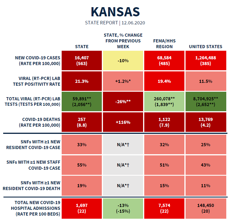
Good evening! Today we’ll discuss the most recent data from the White House Coronavirus Task Force report for the state of Kansas. The table above shows the summary data for Kansas and how they compare to the US. You’ll notice that most of the table is shaded in red. There are some confusing pieces in this week’s report and we’ll walk through those in the following sections. Overall, Kansas has the following rankings in the report:
New case rate per 100,000, #12, dark red zone
Test positivity, #5, dark red zone
New COVID-19 hospital admissions per 100 beds, #18, red zone
New death rate per 100,000, #19, red zone
Some of their recommendations are provided below. I’ve highlighted some sections that warn us against any indoor gatherings with people from outside our households, good signs and warnings regarding hospitalizations, and things that have worked for university settings.
Testing
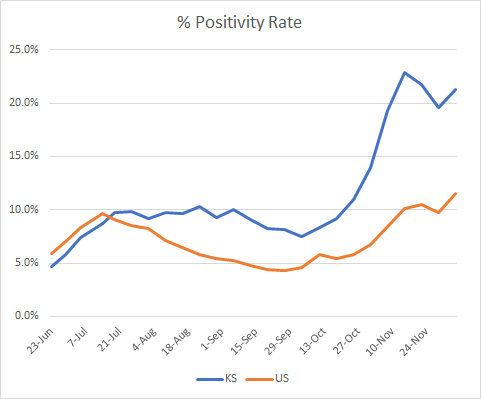
The Kansas percent positive rate remains well above the national rate. The difference is actually 85% higher than the US rate. It’s a shame to see the percent positive rate bounce back up - it looked like we had peaked. A reminder, this metric tells us whether the state is doing enough testing to identify most cases. The higher the positive rate, the more likely we are missing cases that go on to contribute to community transmission.
The map below shows the percent positivity across different counties across the state. Most counties are colored in various shades of red.
There might be an error in the White House Coronavirus Task Force report. They indicate that this week’s test rate per 100,000 in Kansas is 2056, which would represent an increase of 34.5% compared to the previous week. Meanwhile, the summary table indicates that test rate decreased by 26%. This is a pretty significant contradiction. It also seems to contradict the state’s data for that same time period.
Here’s the test data from the Kansas Department of Health and Environment. This is a busy graph. Let’s walk through how to read it. The x-axis (horizontal) shows dates. The bars represent tests per day (total in orange, positive in blue). Those tests correspond to the left y-axis (vertical). The right y-axis shows percent positive and this corresponds with the green line on the graph. I’ve shaded the window of time that corresponds to the dates indicated in the WHCTF report for their data collection period. We can pretty easily see that bars in that window are shorter than the previous week. But the actual numbers are 15,769 fewer tests in the window than the week before.
Cases
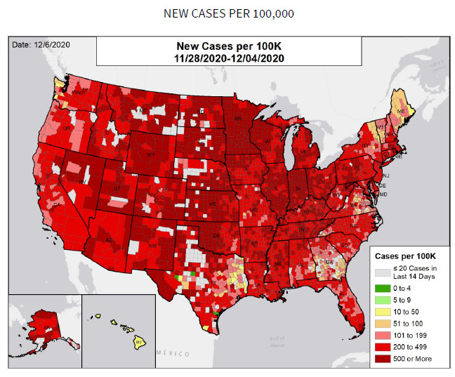
Let’s begin with a look at the national map for new cases per 100,000 so that you can gain a sense of the scope of our problem. Kansas is among the states nearly completely filled in with red counties - not just red counties but dark red counties.
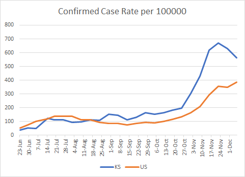
The WHCTF shows Kansas new case rate per 100,000 declining over the past two weeks - welcome news. The national case rate is rising and is only 32% less than the Kansas rate.
As seen for the national map, here’s a closer look at Kansas for new case rate per 100,000.
Hospitalizations
The graph below from the WHCTF report indicates that hospital admissions have declined (as does the summary table). But that’s inconsistent with the data that Kansas released by that same date.
I graphed the cases, hospitalizations, ICU admissions and deaths on December 4th, the data cutoff date for the December 6th WHCTF report. Hospital admissions are represented by the gray line and show an increase. The data source for the WHCTF is the HHS Protect Data Hub. Perhaps they have a different data collection than the state of Kansas.
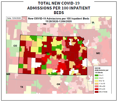
This week we get to see new maps showing how hospital admissions vary across the state. Many Kansas counties are shaded in red. This is based on county of residence, not county of hospital admission.
Deaths
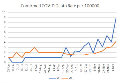
Meanwhile, the death rate for Kansas has risen dramatically, more than doubling in the past week. In addition, the Kansas death rate is also twice the national rate.
The map below shows where the new deaths per 100,000.
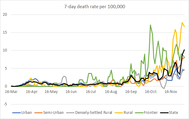
Here’s how that death rate increase is playing out by county type. The state average is represented by the black line. You can see that the yellow line (rural counties) are quite a bit higher than the state rate.
It might also be important to consider this graph that shows the death rate per 100,000 residents by race. As a reminder, this graph *is* adjusted for population. What we see is that the death rate among those of “Other” race, which typically includes the majority of people who identify as Hispanic or Latinx, is more than twice the death rate of White populations.
Please make good choices regarding disease exposures. This pandemic most certainly is not over.
References
Full White House Coronavirus Task Force report for the state of Kansas: https://beta.documentcloud.org/documents/20421831-kansas-12_6_20
Kansas Department of Health and Environment COVID-19 data hub: https://www.coronavirus.kdheks.gov/160/COVID-19-in-Kansas
Kansas COVID-19 Updates is a free newsletter that depends on reader support. If you wish to subscribe please click the link below. There are free and paid options available.
My Ph.D. is in Medical Microbiology and Immunology. I've worked at places like Creighton University, the Centers for Disease Control & Prevention and Mercer University School of Medicine. All thoughts are my professional opinion and should not be considered medical advice.


