This week’s White House Coronavirus Task Force (WHCTF) report still isn’t available, though I have an open records request pending. Meanwhile, I’ll highlight what’s being said for our neighbor to the east (Missouri) and share some of the information that is provided for all states in the back of the report. There’s also a lot of information we can go through that is specific to the data coming from the Kansas Department of Health and Environment (KDHE).
Missouri has experienced a pretty dramatic increase across all four key metrics (testing, cases, hospitalizations and deaths). I’ve gone through them in a thread on Twitter if you’re interested in seeing the trends for Missouri.


The language this week in the Missouri report is far more direct than we’ve seen in the past few weeks. I think it spells trouble for Thanksgiving gatherings. It’s possible, given our proximity, that we might have similar recommendations in the Kansas report.
For new cases per 100,000 in the map below you can see that a large swath of the center of the US is covered in red. Kansas has some blank or pink-shaded counties. Kansas is ranked #11 in the country for new cases per 100,000 (in the red zone) according to the WHCTF.
We are ranked #6 in the nation for percent positivity among PCR tests (red zone). This isn’t like golf, you’d rather be ranked #50 in the nation if possible. But a relative bright spot for Kansas is that our death rate isn’t as severe as our case rate or our percent positive rate. We are ranked #26 for new deaths per 100,000 residents, placing us in the orange category.
Testing
Kansas has come a long way as far as making testing available for its population. But we seem to have reached a ceiling since July, even as cases grow.
Over the past month, here’s how the state’s percent positive rate has varied over time. The red dashed line is the goal set by the World Health Organization. The higher we are above the red line, the more likely that we are not testing widely enough and are probably missing cases that contribute to ongoing disease transmission.
Cases
The net increase in cases between the KDHE reports on Monday and Wednesday of this week was 2,988 and that brings the statewide total to 92,215. Compared to the previous Wednesday, there were 381 fewer cases reported this Wednesday. That’s hopeful news. Let’s take a look at how these new cases are impacting the 7-day case rate per 100,000 over time for different county types.
You can check to see which county class pertains to your home county here. As you can see in the graph above, things have escalated very quickly. We may, in fact, be experiencing exponential growth. Rural counties have quickly caught up to the high case rates in frontier counties. The statewide average (black line) has increased by 79% since October 26th. Next, let’s look at how the cases have varied by age group over time.
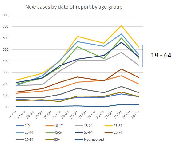
There are a LOT of lines on this graph and it might be overwhelming. But there are some interesting trends here. The Kansas population can sort of be divided into three categories here. The high case count group is a cluster of age groups between 18 - 64 years of age. The next tier, let’s call them the medium case count group, consists of the nearest neighbors to the high case count group, those 10-17 and those 65-74. The low case count group features those at the youngest and oldest age groups: 0-9 and 75+. It’s good that case counts are relatively low for those over the age of 75, but even low case counts have severe consequences for them, as we’ll see in the hospitalizations and deaths section. But perhaps this helps our younger adult populations (18-64) to recognize that while they may not suffer severe consequences of this pandemic, they are the main drivers of this pandemic. If they can minimize their exposures it will save lives.
Hospitalizations
The net increase in hospital admissions between the KDHE reports on Monday and Wednesday of this week was 91 and that brings the statewide total to 3,982. The proportion of ICUs in use for COVID-19 patients has increased by 36% in the past two weeks. Meanwhile the proportion of ventilators in use by COVID-19 patients has risen 11.6% in that same time frame.
Let’s take a look at how hospital admissions have varied over time for each age group.
Again, it’s a lot of lines. The top three age groups are all brown in color and represent those 65+. The age group with the sharpest increase, and currently leading, is those 65-74. For most other age groups, the number of hospitalizations has held steady or decreased. So to connect the dots with where we were on cases, our current case surge is driven mainly by those 18 - 64. And the consequence of that is hospitalizations surging in those 65+.
Deaths
The net increase in deaths between the KDHE reports on Monday and Wednesday of this week was 41 and that brings the statewide total to 1,087. The updated case fatality rate is 1.2%. Next, let’s take a look at how the death rate has changed for different county types around the state.
You’ll notice that the rate has decreased, and even gone negative, for the densely-settled rural county class. That’s usually due to data corrections. For example, de-duplicating someone who tested positive twice or maybe they entered the data for the wrong county, etc. The larger story here is that death rate continues to be really high for frontier counties in Kansas and rural counties aren’t far behind. Given that this is the same trend for recent cases and we know that deaths lag cases by about 3 weeks, we might expect to see these numbers go even higher in the coming weeks. I really hope that doesn’t happen, of course.
Next, let’s look at how new deaths have compared over time across age groups.
It’s probably not a surprise that the two oldest age groups are leading the daily net change in cases over time, and recently too. But in the last few days we’ve seen an increase among those 55+, with the sharpest increases for those aged 75+. Again, if we connect the dots with cases and hospitalizations, our case surge is being driven by 18 - 64 year olds, but hospitalizations are most intense for those 65+ while the increase in deaths is most significant for those 75+. Again, the more that 18-64 year olds can do to limit their exposures and unintended disease spread to others, the more lives we can save.
Combined Data
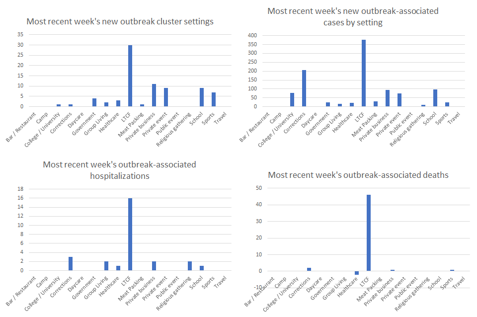
This last section compares the outbreak (cluster) data for this week compared to last week. The horizontal axis labels are the same for each graph, but the y-axis changes due to the numbers presented for each type of data.
Starting in the upper left, the leading sources of outbreaks in the most recent week (total = 78 new clusters) were long term care facilities (LTCFs), private businesses, and then there’s a tie between schools and private events. Moving to the upper right, in the past week, the cluster settings associated with the most COVID-19 cases were LTCFs, corrections, and schools. In total, there were 1056 new cases associated with outbreak clusters in the past week, compared to the 10,170 reported during the same time frame. In other words, only 10.4% of last week’s cases could be tied to a known cluster. The rest of the cases were due to uncontrolled and widespread community transmission - casual encounters that we don’t think anything of or social gatherings among friends and family. It’s important to remember that you can love and trust someone very much and still accidently give them a potentially fatal illness. The virus does not have feelings or sympathy. It is just looking for the next person to infect for its own survival. The virus cannot move without people and when people gather we give the virus new opportunities to survive and thrive.
Moving on to the lower left, the top three cluster settings associated with hospitalizations in the past week were LTCFs, corrections and a tie between group living settings, private businesses and religious gatherings. Finally, on the lower right, we see that the top three settings associated with deaths in the past week were LTCFs, corrections and a tie (one apiece) among private businesses and sports.
I imagine you see that there’s a trend here…LTCFs are being impacted disproportionately for all of these metrics. But correctional facilities were another big driver of cases, hospitalizations and deaths. Both of these settings are sort of the last place you want COVID-19 to be spreading. Social distancing, ventilation and risk mitigation more broadly is extremely difficult in these confined settings and the inhabitants can do little to improve their situation.
That’s it for today. I’ll hopefully have the Kansas WHCTF report today or tomorrow and will send another update with that information when it’s available. Be safe and be well!
References
https://www.coronavirus.kdheks.gov/160/COVID-19-in-Kansas
https://www.documentcloud.org/documents/7281679-Missouri-11-1-20.html
http://www.ipsr.ku.edu/ksdata/ksah/population/popden2.pdf


